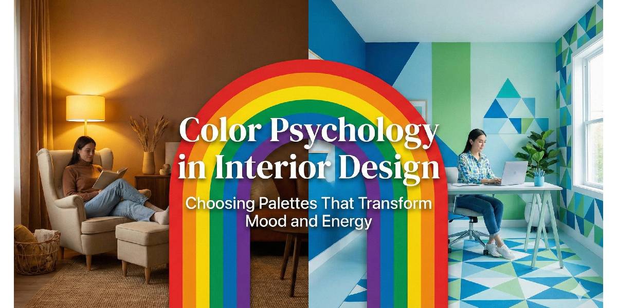
Color is one of the most powerful tools in interior design, yet it’s often underestimated. Beyond aesthetics, color has a profound psychological impact on how we feel, think, and behave within a space. From creating calm and focus to boosting energy and creativity, the right color palette can completely transform the mood and functionality of an interior.
In today’s design landscape, where homes and workplaces are expected to support well-being as much as style, understanding color psychology is essential. This article explores how different colors influence mood and energy, how to choose the right palettes for various spaces, and how thoughtful color selection can elevate interior design outcomes.
What Is Color Psychology in Interior Design?
Color psychology is the study of how colors affect human emotions, perceptions, and behavior. In interior design, it helps designers create spaces that not only look good but also feel right.
Every color carries emotional and psychological associations shaped by biology, culture, and personal experience. When applied intentionally, color can:
- Influence mood and energy levels
- Make spaces feel larger or cozier
- Encourage relaxation or productivity
- Support emotional well-being
Interior design is no longer just about trends, it’s about creating environments that positively impact daily life.
Why Color Choice Matters More Than Ever
Modern lifestyles have blurred the lines between work, rest, and leisure. Homes double as offices, cafés, and wellness spaces, while commercial interiors aim to enhance productivity and customer experience.
Poor color choices can:
- Cause visual fatigue
- Increase stress or restlessness
- Make spaces feel uncomfortable or unbalanced
On the other hand, thoughtful palettes can:
- Promote calm and focus
- Enhance creativity and motivation
- Improve spatial harmony
Color is not decoration, it’s strategy.
Understanding the Psychological Impact of Major Colors
Blue: Calm, Focus, and Trust
Blue is widely associated with tranquility, stability, and clarity. It’s ideal for:
- Bedrooms
- Home offices
- Corporate environments
Lighter blues promote relaxation, while deeper shades evoke professionalism and trust, making blue a favorite in both residential and commercial interiors.
Green: Balance, Renewal, and Harmony
Green represents nature, growth, and balance. It’s one of the most versatile colors in interior design.
Best used in:
- Living rooms
- Wellness spaces
- Healthcare and hospitality interiors
Green reduces stress and creates a refreshing atmosphere, especially when paired with natural materials like wood and stone.
Yellow: Energy, Optimism, and Warmth
Yellow stimulates positivity and mental activity. It works well in:
- Kitchens
- Dining areas
- Creative spaces
However, overuse can feel overwhelming. Muted or pastel yellows are often more effective than bright, saturated tones.
Red: Passion, Energy, and Intensity
Red is bold and emotionally charged. It increases energy levels and draws attention.
Common applications include:
- Accent walls
- Dining spaces
- Entertainment areas
Because red can feel intense, it’s best used sparingly or balanced with neutral tones.
Neutral Colors: Sophistication and Flexibility
Neutrals such as white, beige, gray, and taupe form the foundation of many interiors.
They offer:
- Visual calm
- Timeless appeal
- Flexibility for accent colors
Neutrals are especially effective in modern and luxury interiors, allowing textures, lighting, and furnishings to shine.
Choosing the Right Color Palette for Different Spaces
Living Rooms: Balance Comfort and Energy
Living rooms should feel welcoming and adaptable. Popular choices include:
- Warm neutrals with earthy accents
- Soft greens or blues for relaxation
- Accent colors through cushions, art, or rugs
The goal is balance, neither too stimulating nor too subdued.
Bedrooms: Prioritize Calm and Rest
Bedrooms benefit from soothing colors that promote sleep and relaxation:
- Soft blues
- Muted greens
- Warm neutrals
Avoid overly bright or high-contrast colors that can disrupt rest.
Kitchens: Encourage Energy and Interaction
Kitchens are social and functional spaces. Effective color choices include:
- Whites and light neutrals for cleanliness
- Yellows for warmth
- Deep blues or greens for modern elegance
Color can also influence appetite and mood, an important consideration in dining areas.
Offices and Workspaces: Boost Focus and Productivity
Color plays a crucial role in work environments:
- Blue enhances focus and efficiency
- Green reduces eye strain
- Neutral bases with subtle accents maintain professionalism
Well-chosen palettes can significantly impact performance and morale.
Cultural and Environmental Influences on Color Choice
Color perception varies across cultures and environments. In regions with intense sunlight and warm climates, lighter and cooler tones are often preferred to create visual comfort and balance.
For example, in luxury residential and commercial projects, an experienced Interior design company in Dubai often selects palettes that:
- Reflect natural light effectively
- Balance warmth with cooling tones
- Align with cultural preferences for elegance and sophistication
Understanding local context is just as important as understanding color theory.
The Role of Lighting in Color Psychology
Lighting dramatically affects how colors appear and feel.
Key considerations include:
- Natural vs artificial light
- Warm vs cool lighting temperatures
- Time of day and shadow patterns
A color that looks perfect in daylight may appear dull or harsh under artificial lighting. Successful interior design always considers color and lighting together, not in isolation.
Using Accent Colors to Shape Mood
Accent colors are powerful tools for influencing energy without overwhelming a space.
They can:
- Highlight architectural features
- Add personality and depth
- Create visual interest
Common accent strategies include:
- Bold cushions or artwork in neutral rooms
- Metallic finishes for luxury appeal
- Natural tones for organic warmth
Small color changes can have a big emotional impact.
Trends vs Timeless Color Palettes
While trends come and go, the psychological effects of color remain consistent.
A smart approach is to:
- Use timeless base colors
- Incorporate trends through accessories and accents
- Prioritize emotional comfort over short-lived styles
This ensures interiors remain appealing and functional for years.
Common Mistakes in Color Selection
Some frequent pitfalls include:
- Choosing colors without considering room function
- Ignoring lighting conditions
- Overusing bold or dark tones
- Following trends blindly
Professional interior designers help avoid these mistakes by combining aesthetics with psychology and technical expertise.
How Professional Designers Use Color Strategically
Interior designers don’t just pick colors, they design experiences.
Their process often includes:
- Understanding client lifestyle and preferences
- Analyzing space orientation and lighting
- Creating mood boards and test palettes
- Balancing color, texture, and materials
This strategic approach ensures that interiors support both emotional well-being and visual harmony.
Final Thoughts: Color Is Emotion Made Visible
Color has the power to transform spaces on a psychological level. When chosen thoughtfully, it enhances comfort, energy, productivity, and overall quality of life.
Whether designing a home, office, or commercial space, understanding color psychology allows interiors to move beyond decoration and become meaningful environments. Collaborating with a professional Interior design company in Dubai that understands both global design principles and local context can help translate color theory into spaces that truly inspire.
In interior design, color isn’t just what you see, it’s what you feel.